Showing posts with label Color Club. Show all posts
01 June 2016
Color Club Gift of Sparkle
Gorgeous plum/purple base with scattered holo glitter. Two coats, but it swallowed top coat - this is one coat of top coat and it could really have done with a second to smooth it and really bring out the holo.
Labels:
Color Club,
Daily Nail,
Nail of the Day,
Nail Polish,
Nails
18 September 2010
Today's nails: Color Club Poptastic
Poptastic is the final colour in the seven piece Poptastic Collection.
Poptastic is a neon Barbie pink. Good application in two coats and again it has the vinyl-like finish of neons (shown in the pictures however with a topcoat). For me this colour isn't a thriller, but I'm not a pink lover, and where Warhol won me over because of its depth of colour and its unusual orange tinge Poptastic is a fairly standard neon pink. That said, if you're a pink lover I think you'll like this one.
So that wraps up the Poptastic Collection. All in all a great collection. Formula-wise, with the exception of Almost Famous the polishes had great application, far exceeding what I would expect from a neon. Color Club have done a great job in improving the formula over the old neon collection which Poptastic replaced.
Aside from Poptastic I loved all the colours. If you're a neon lover, or looking to add a pop of bright colour to your summer mani/pedi you should definitely check this collection out.
Thank you once again to Color Club NZ for providing me with this collection for review.
16 September 2010
Today's nails: Color Club Wham! Pow!
Wham! Pow! (from Color Club's Poptastic Collection) is possibly the most aptly-named polish ever - it's a total assault on the retinas!
My camera took one look at this colour and started quaking at the knees - it just couldn't capture it accurately! The bottle colour in the first photo is probably closest to what it actually looks like on the nail - glowing and neon and BRIGHT! Seriously, this colour is SO bright I swear if I touch my nails they'll be burning hot!
The formula on Wham! Pow! is lovely, thinnish and easy to apply. I used three coats because I thought I could see a little visible nail line, but I think two would probably have been ok. The finish is your typical neon satin, it's shown here with a top coat.
14 September 2010
Today's nails: Color Club Almost Famous
Today's colour from the Color Club Poptastic Collection is Almost Famous.
I really like yellow polishes, but they don't often like me - yellow's just not a great colour for my skintone. I really like the banana yellow of Almost Famous on me though.
Look at that - bright and cheerful and banana-y!
This was, however, a total pain in the patootie to apply. The formula is quite thick and it pooled at the sides, dragged, and refused to settle into a flat finish. Even after three coats and a top coat of Seche Vite, which normally smooths out an uneven polish, it still looks lumpy and uneven to me, athough it's not so obvious in the photos.
Still, an easy-to-apply yellow is a rarity in my experience, and Almost Famous is a keeper because of it's gorgeous colour.
(My nails haven't suddenly grown longer overnight, by the way. I glued on some acrylic nails last night because my natural nails were so soft and kept breaking off right at the quick. Which explains the state of my cuticles - I may have used a wee smidge too much glue!)
13 September 2010
Today's nails: Color Club Chelsea Girl and Warhol
Today I have two more colours from the Color Club Poptastic Collection for you. First up Chelsea Girl:
Brighter and darker than this photo shows (ain't that always the way), this is a vibrant jellyish royal blue. The formula on this was thinner than the others from this collection that I've tried so far and had a tendency to either pool at the sides or go on quite sheer. By the second coat, however, coverage was good and the thinness of the formula didn't make application particularly difficult. (I wore this a few days ago now, and I can't for the life of me remember whether it was two or three coats in the end - I think it was only two though.) This was another colour that I got heaps of compliments on.
Warhol:
Now I make no secret of my dislike for pink nail polishes, but dammit if I don't love this one. Warhol is a bright, hot pink that has an amazing orange glow to it which is not evident in the photo. A true neon (blindingly so), application on this was absolutely lovely.
Both colours are shown with top coat, without they again have the satiny finish of neons. To give you a bit more of an idea of how it looks on, and also so you can fall about laughing, here I am rocking Warhol on my nails dressed as Madonna circa Desperately Seeking Susan for 15 Year Old Daughter's birthday party in the weekend:
The theme of the party was 'Backstage Pass' and 15 Year Old Daughter insisted that I had to dress up too. I suspect she ended up regretting that. 11 Year Old Son's reaction was to yell "NOOOOOOOOOOOO" and run away. But the highlight of the evening was forgetting I was in costume when I opened the door to the pizza man. To say he looked startled would be the understatement of the year!
08 September 2010
Today's nails: Color Club Pucci-licious and Twiggie
Color Club's Poptastic range was released into New Zealand stores at the start of September, and Color Club New Zealand very kindly sent me out a seven piece pack for review.
Left to right: Almost Famous, Wham! Pow!, Poptastic, Warhol, Pucci-licious, Twiggie and Chelsea Girl.
The Poptastic Collection replaces the Flower Power Neon range and contains 20 shades in all. Some favourite shades from the Neons have been kept and renamed, and several new shades have been introduced.
The first two shades I swatched were Pucci-licious and Twiggie and both colours surprised me with their fabulous application - I generally expect neons to be trouble to apply but not these two. Both are highly pigmented and the formula on Pucci-licious was lovely and smooth, going on evenly and only requiring two coats. In fact I suspect if I applied it again I could make it a one coat application. Twiggie was a little thicker in consistency so required slightly more careful application but went on in one coat, something I've never had before with a neon.
First up Pucci-licious, which being a purple was beyond impossible to capture, photographing more dusky and with more blue than it has in real life.
This picture was taken before I applied top coat, and you can see the semi-matte satin finish common to many neons.
Because that picture is so completely inaccurate in representing the colour, check it out y'all - my mad Paint skills:
Makes me look like I have the world's worst fake tan! Still not particularly representive, you'll just have to trust me that Pucci-licious is a gorgeous bright grape purple which I got heaps of compliments on.
Twiggie is bright, summery green somewhere between mint green and pea green.
A real stand-out colour that you can't help noticing - love it.
10 April 2010
Today's nail: Color Club Electronica
Today's polish from Color Club's Dance to the Musique collection is Electronica, a vibrant blurple jelly packed with pink shimmer:
Of course the camera captured this leaning towards blue, but it is more purple (see the collection shot at the top of the post for a better example of the colour) and it didn't even begin to capture the gorgeous shimmer properly. I never get sick of colours like this. There are many of them around - some of which are more dupe-ish than others - but Electronica is a fabulous example and definitely a standout. Two lovely coats to apply, if you're a blurple/shimmer fan you need this baby in your collection!
09 April 2010
Today's nail: Color Club Feel the Beat
Today's polish from the Dance to the Musique collection is Feel the Beat. I wasn't sure about this one in the bottle, it looked like it could be a bit too 'safe' for my liking, but actually on the nail it's not bad at all. (Before you look, I apologise for the state of my cuticles - moisturiser STAT!):
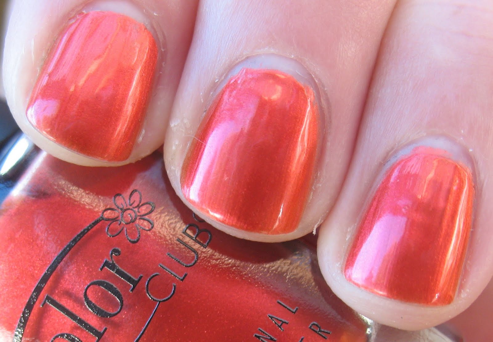
Feel the Beat is a coppery-orange almost metallic that reminds me of glowing embers in a fire. (Poetic, yes?) Two coats and nice application that was just the tiniest bit brush-strokey. I did notice this morning there are a couple of bald spots near my cuticles - the polish probably took one look at the state of my cuticles and tried to run away. Also, note to self: stop anthr... anthropo... anthromo... giving nail polishes human characteristics.
08 April 2010
Today's nail part two: Color Club Groove Thang
The second collection released by Color Club for the New Zealand winter 2010 season is Dance to the Musique, which Color Club NZ generously provided me with to swatch for you:
Left to right: Feel the Beat, Velvet Rope, Slow Jam, Electronica, Groove Thang and After Hours.
Groove Thang intrigued me in the bottle with its purple shimmer and hints of peacock blues and greens. Somewhat disappointingly though the blues and greens fail to make an appearance on the nail.
Groove Thang does redeem itself in my eyes by being a gorgeous dark dark purple jelly (of the "so dark it's almost black" ilk) with a lighter purple shimmer packed into it that really shines when the light hits it, and I do love it, even if I am a bit disappointed that it didn't turn out like it promised in the bottle.
Lovely formula that only required two coats, and it could possibly be a one coater if you apply your polish thicker than I. And also, how gorgeous does it look with my new ring?
More to the point: how gorgeous is my new ring?
Today's nail: Color Club Love 'Em Leave 'Em
Love 'Em Leave 'Em is the last of the six polishes in the Wild At Heart collection, and the one with a true holographic glitter which is just gorgeous in the light.
There was, however, a reason I left Love 'Em Leave 'Em till last to swatch - the holo may be beautiful but the beige base colour is so totally not me. The whole day I was wearing it I would catch a glimpse of my nails and think "meh, beige". It's nothing personal against this polish - I just don't do beige. If you do though I recommend this polish, especially if you're looking for something work-appropriate but with a bit of fun. Lovely application in two coats.
That wraps up the Wild At Heart Collection, and as a whole I absolutely love it. Five glitter bombs and one metallic and (with the exception of Love 'Em Leave 'Em) some gorgeously dramatic colours - this could well qualify as my favourite collection ever, with Wild At Heart being my favourite colour-wise and Wild And Willing getting my vote for most unusual. If you like your glitters go get this collection, it won't disappoint.
05 April 2010
Today's nail: Color Club Wild And Willing
Next to Wild At Heart (the polish), the other colour from the Wild At Heart collection I coveted was Wild And Willing, and in fact thanks to my lovely friend Ewa in London I managed to get my hands on a bottle of it even before Color Club was being stocked in New Zealand. So now I have two bottles - man, but it's a hard life.
In terms of uniqueness Wild And Willing is the stand-out of the collection. Off the top of my head (is that not the weirdest saying ever?) I can't think of another colour like it.
Wild And Willing is truly magical. While holographic in nature the pedant in me doesn't class it as a true holo because, like Wild At Heart, it doesn't show the full rainbow spectrum one expects from a holo. The glitter in this copper coloured beauty flashes gold and, most intriguingly, green. Unfortunately there was no way my camera was going to capture the green flash for you, but it is there and it is quite alien-like when you see it.
Wild and Willing has a very thin and sheer jelly base - I used three coats but upon close examination of my photos I can see some bald spots, so four might have been preferable.
04 April 2010
Today's nail: Color Club Rule Breaker
Here's a surprise for you: a blue/green that refuses to photograph true to colour. It's like the curse of the nail polish blogger, trying to photograph purples and blue/greens - both colours always lean blue in the photo. Grrr.
Aww look, you even get a Fred hair on the bottle for good measure. Just be glad you don't have smell-o-vision because dammit that dog smells at the moment. And of course if I don't bathe him no one will. I tried to convince 14 Year Old Daughter to do it the other day, she ran away muttering something about how that would mean having to "touch his bits". Ok so Fred's an entire male and his 'bits' are quite impressive, but I wash him all the time and suffer no ill effects. In fact Fred and I now have a very, very close relationship ...
Anyway, enough discussion of dog bits, you'll have to believe me when I say Rule Breaker leans much more green than you see in the photos (or indeed in the promo picture at the top of the post). This is one of those colours that I think of as 'peacock' shades, and in fact if you imagine a peacock feather with green fading through to blue, Rule Breaker would be the green in the feather.
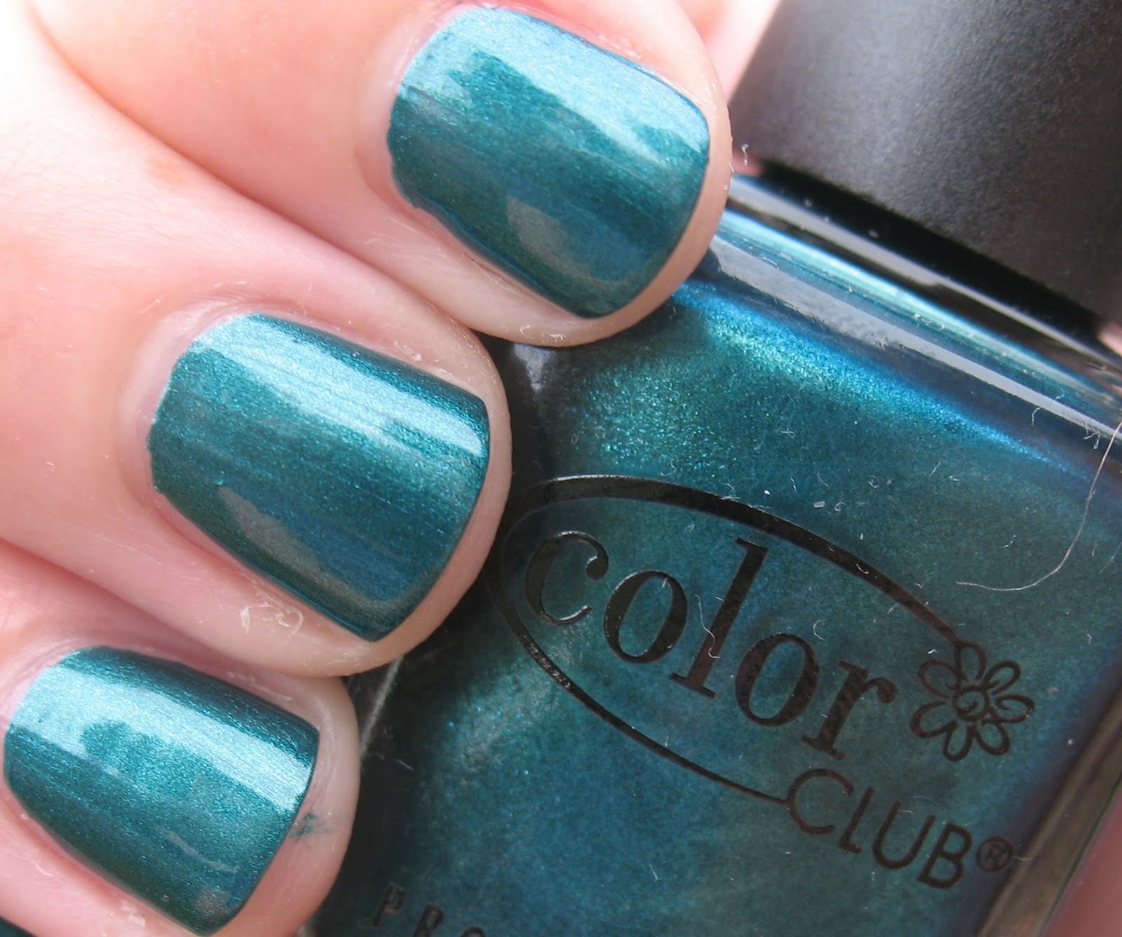
Rule breaker is a shimmer, but it almost almost qualifies as a duochrome - in certain lights you'll just catch a flash of a blue. It's very very pretty and another fabulous one coater. Oh how I love one coat colours!
03 April 2010
Today's nail: Color Club With Abandon
Black-based glitters are one of my favourite nail polish colours, and With Abandon is a gorgeous example.
A black jelly base so jam packed with copper coloured glitter that in some lights it takes on a brownish hue, I love this colour. The jelly base is very thin though so while lovely to apply it did take three coats to become opaque, and there is some baldness visible near the cuticle in some of the photos, even though I can't see it in real life. This is one of those polishes that is going to have me staring at my nails in different lights all day to admire the effect of the glitter.
02 April 2010
Today's nail part two: Color Club Wild At Heart
Of the six in the Wild At Heart collection the eponymously named purple was probably the one I was most keen to check out, and Woah Mama did she not disappoint.
Fellow polish bloggers will feel my pain when I say this was a real bugger to photograph - as purples always are. The first picture would be the most colour correct, the second picture is too blue but shows perfectly the glitter-packed deliciousness of Wild At Heart.
I would guess that Wild At Heart is meant to be a holo - to my eye it doesn't have the full rainbow spectrum of glitter that a true holo would show, it is a total glitter bomb though. And - wait for it- one coat. One. Coat. Beautiful application, quick drying, did I mention one coat? Wild At Heart, I'm wild about you!
Today's nail: Color Club On the Wild Side
My pretties it seems like ages ago I promised you a look at the two Color Club collections being released here in New Zealand in March and then ... nothing. Blame my nails, they have been quite ill behaved, with the splitting and the not growing and the breaking off, so they were grounded. There was a whole couple of weeks there where I didn't put any polish on them at all. None! And boy were they suitably chagrined. So while they may still be tiny nubbins they are wearing polish again.
Of all the collections I saw released in the Northern Hemisphere in recent months, Color Club's Wild At Heart was possibly the one I was coveting the most, so you can imagine how delighted I was when the lovely people at Color Club NZ told me it was being released here at the start of March, and very kindly provided me with a set to swatch for you all. And my word they are just as gorgeous in the flesh (in the bottle?) as I'd hoped.
Left to right: Love 'Em Leave 'Em, Wild and Willing, On the Wild Side, Rule Breaker, Wild At Heart, With Abandon.
After agonising for what seemed like ages last night over which one I wanted to try first, I settled for On the Wild Side.
Excuse the ding on my middle finger - I had an urgent need to go to the toilet the instant I applied my topcoat - ain't that always the way? The ding on my pointer finger though, that's a great big hole in my nail where I picked at a bit of dead cuticle and ended up digging a hole because my nails were just peeling away. I told you they were in bad condition!
Interestingly this wasn't a colour that stood out for me when I saw the collection swatched on other blogs but actually I loved it on me. It's a blue/grey metallic that reminds me of pewter. Of course we expect a metallic to be brushstrokey and it was, enough that it required careful application but not so much that it does my head in when I look at it. My tip for applying brushstroke-prone polishes: instead of the prescribed center/side/side order of application, try side/side/center. Just make sure you don't load your brush too much though or you'll end up with your polish pooling at the sides.
Two coats to opaque, and as always with Color Club polishes dry time was excellent, or there would have been a heck of a lot more damage from the urgent toilet trip!
More from this collection in the following days, and thank you again to Color Club NZ for providing these for review.
Of all the collections I saw released in the Northern Hemisphere in recent months, Color Club's Wild At Heart was possibly the one I was coveting the most, so you can imagine how delighted I was when the lovely people at Color Club NZ told me it was being released here at the start of March, and very kindly provided me with a set to swatch for you all. And my word they are just as gorgeous in the flesh (in the bottle?) as I'd hoped.
Image courtesy Color Club NZ
Left to right: Love 'Em Leave 'Em, Wild and Willing, On the Wild Side, Rule Breaker, Wild At Heart, With Abandon.
After agonising for what seemed like ages last night over which one I wanted to try first, I settled for On the Wild Side.
Excuse the ding on my middle finger - I had an urgent need to go to the toilet the instant I applied my topcoat - ain't that always the way? The ding on my pointer finger though, that's a great big hole in my nail where I picked at a bit of dead cuticle and ended up digging a hole because my nails were just peeling away. I told you they were in bad condition!
Interestingly this wasn't a colour that stood out for me when I saw the collection swatched on other blogs but actually I loved it on me. It's a blue/grey metallic that reminds me of pewter. Of course we expect a metallic to be brushstrokey and it was, enough that it required careful application but not so much that it does my head in when I look at it. My tip for applying brushstroke-prone polishes: instead of the prescribed center/side/side order of application, try side/side/center. Just make sure you don't load your brush too much though or you'll end up with your polish pooling at the sides.
Two coats to opaque, and as always with Color Club polishes dry time was excellent, or there would have been a heck of a lot more damage from the urgent toilet trip!
More from this collection in the following days, and thank you again to Color Club NZ for providing these for review.
Subscribe to:
Posts (Atom)